
From Figma to WordPress: My Front-End Workflow
The step-by-step process I use to turn a Figma design into a responsive, fast WordPress site that clients can edit on their own.
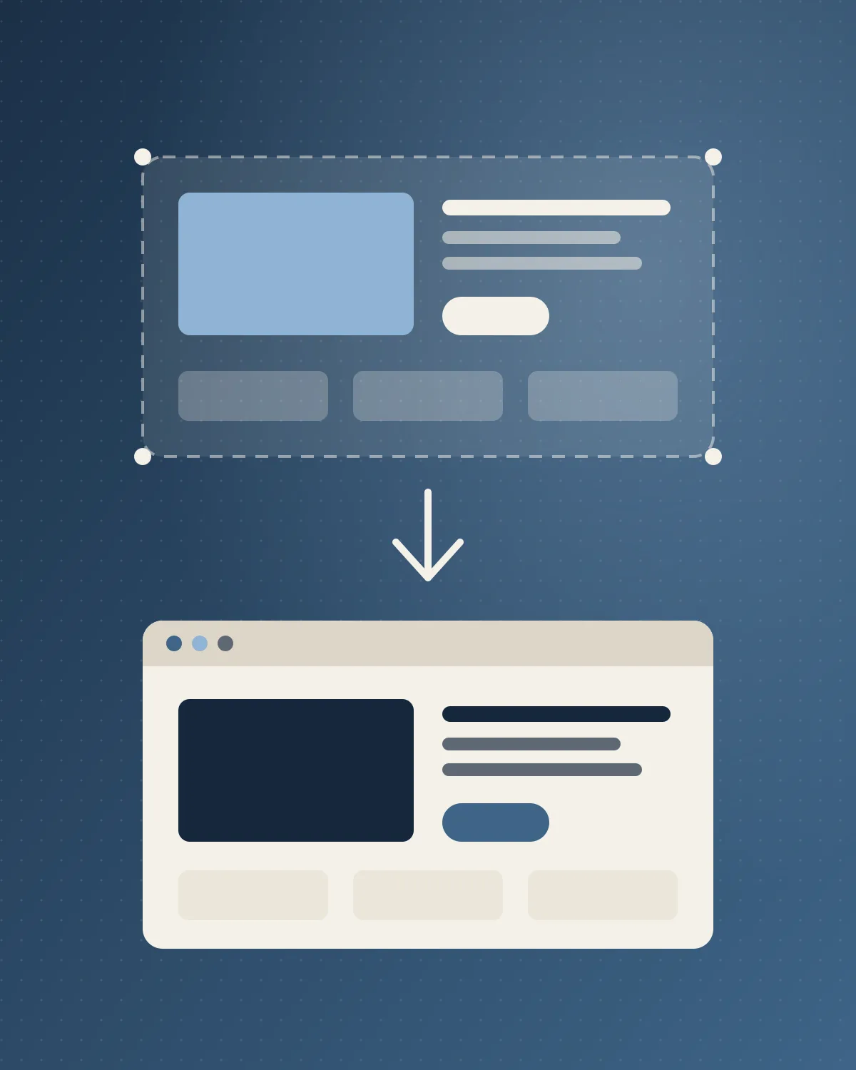
A beautiful Figma file is only half the job. The other half is turning it into a WordPress site that loads fast, works on every screen and stays easy for the client to update. Here is the workflow I follow.
1. Read the design like a developer
Before writing code, I go through every Figma page and note:
- Design tokens: colors, font sizes, spacing and border radius
- Repeated components: buttons, cards, headers, forms
- Responsive gaps: screens the designer didn't draw (tablet is the usual one)
- Content the client will edit versus content that stays fixed
Catching questions now is far cheaper than changing code later.
2. Turn tokens into CSS variables
Every color and spacing value from Figma becomes a CSS custom property. That keeps the site consistent and makes future rebrands a one-file change.
:root {
  --color-primary: #1b3047;
  --space-4: 16px;
  --radius: 14px;
}
3. Build components, then pages
I build each component once, test it at every screen size, and then assemble pages from those pieces. In WordPress this usually means custom blocks or ACF flexible content layouts, so the client can rearrange sections without breaking the design.
4. Make editing safe for the client
Clients should be able to change text and images without touching layout. I give each block only the fields it needs, add sensible defaults, and write short labels inside the editor so nobody has to guess.
5. Test like a visitor
Before launch I check:
- Mobile, tablet and desktop in real browsers
- Keyboard navigation and visible focus states
- PageSpeed Insights scores
- Forms, links and 404 pages
Why this matters
A good handoff means the site looks exactly like the design on day one and still looks right a year later after the client has edited it a hundred times. That's the real goal of a Figma to WordPress build.
Frequently asked questions
What should I check in a Figma file before writing any code?
Go through every page and note the design tokens (colors, font sizes, spacing and border radius), the repeated components such as buttons, cards, headers and forms, the responsive gaps the designer did not draw (tablet is the usual one), and which content the client will edit versus what stays fixed. Catching questions at this stage is far cheaper than changing code later.
How do Figma design tokens become CSS?
Every color and spacing value from Figma becomes a CSS custom property on :root, for example --color-primary, --space-4 and --radius. That keeps the site consistent and makes a future rebrand a one-file change.
Why build components before pages in a WordPress theme?
Building each component once and testing it at every screen size means pages are assembled from pieces that already work. In WordPress this usually means custom blocks or ACF flexible content layouts, so the client can rearrange sections without breaking the design.
How can clients edit a WordPress site without breaking the design?
Give each block only the fields it needs, add sensible defaults, and write short labels inside the editor so nobody has to guess. Clients can then change text and images without touching layout, and the site still matches the Figma design a year later.
What do you test before launching a Figma-to-WordPress site?
Mobile, tablet and desktop in real browsers, keyboard navigation and visible focus states, PageSpeed Insights scores, and forms, links and 404 pages. The goal is a site that behaves like a visitor expects, not just one that matches the mockup.